How to create a Histogram in Excel
First, the Data Analysis "toolpak" must be installed. To do this, pull down
the Tools menu, and choose Add-Ins.
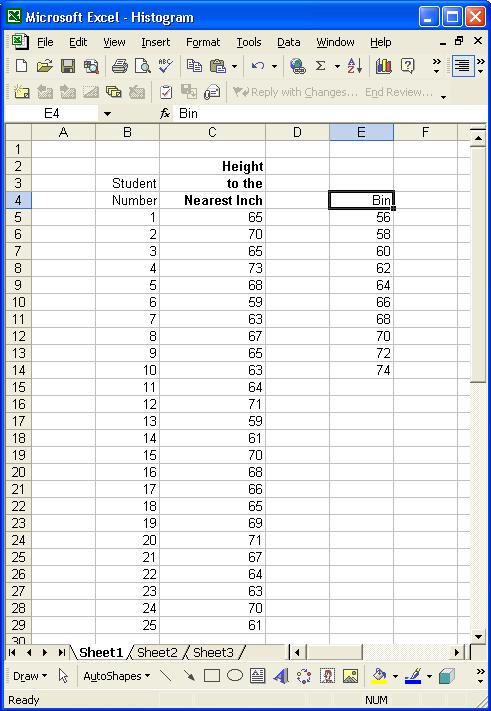
You need to have a column of numbers in the spreadsheet that you wish to
create the histogram from, AND you need to have a column of intervals or
"Bin" to be the upper boundary category labels on the X-axis of the histogram.
See example of spreadsheet below:
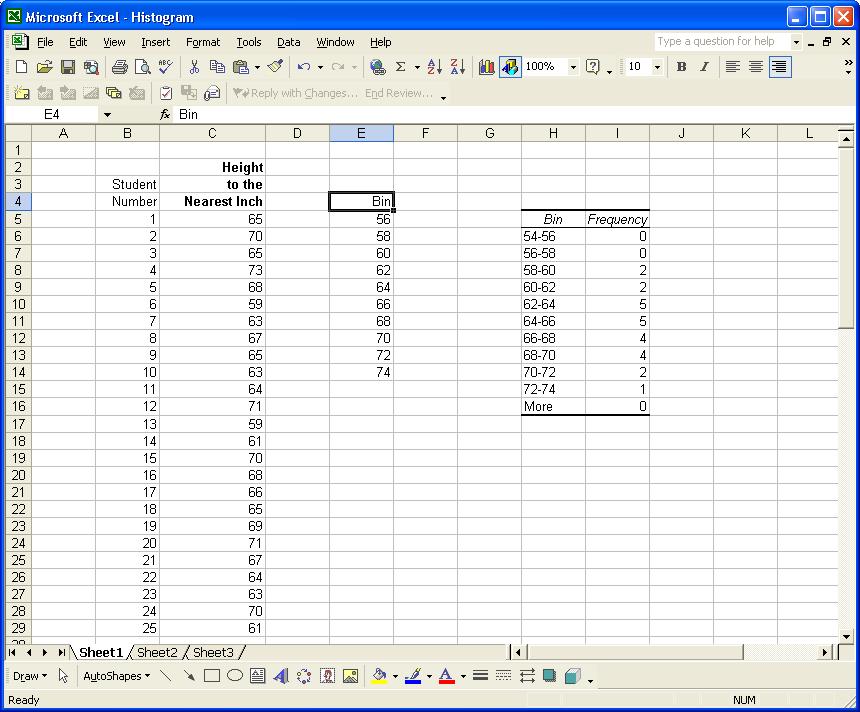
Pull Down the Tools Menu and Choose Data Analysis, and then choose
Histogram and click OK. Enter the Input Range
of the data you want (In the example above it would be C5:C29) and
enter the Bin Range (E5:E14 in example above). Choose
whether you want the output in a new worksheet ply, or in a defined output
range on the same spreadsheet. If you choose in the example above to
have the output range H5, and you clicked OK, the spreadsheet
would look like this:
The next step is to make a bar chart of the Frequency column (I6:I15
in the example above). Block the frequency range, click on the graph
Wizard, and choose Column Graph, click on Finish. Delete the
Series legend, right click on the edge of the graph and choose Source
Data , and enter the Bin frequencies (H6:H15) for the X-Axis Category
labels. Notice the labels have been manually altered to represnet a range
(54-56) instead of just the upper boundary (56). Right click on any
of the bars and choose Format Data Series . Choose the Options
tab, reduce the Gap Width to zero and click OK.
Dress up the graph by right clicking on the edge of the graph and choosing
Chart Options. Enter a complete descriptive title with data
source, perhaps data labels, and axes labels. You may also right click
and format the color of the bars and background. The completed Histogram
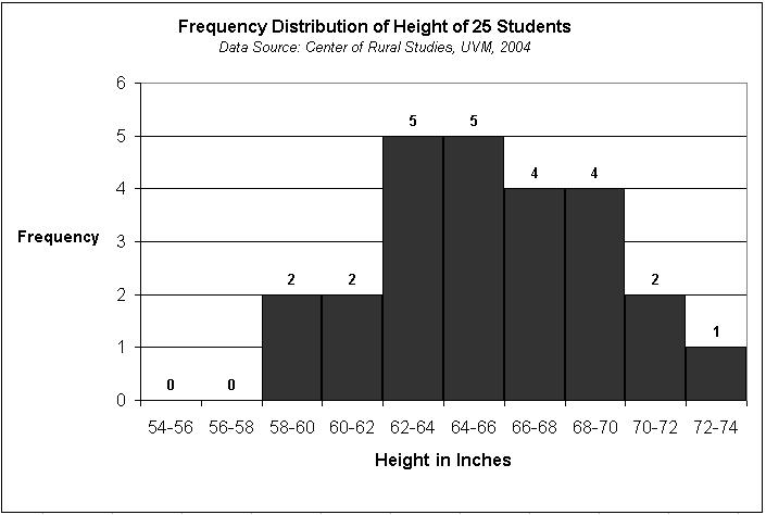
should look something like this: